Netrush Redesign
BRANDING / SOCIAL / WEB DESIGN
2021
Team:
Hannah Amundson, Design
Joce MacDonald, Lead & Strategy
Background
After March of 2020, Netrush saw changes in how employees worked together. Not only now a fully remote workforce, but also a shifting department structure and differences in how we work with our partners through changing services and models. As Netrush’s organization shifted, so did it’s branding. The shift was from originally very whimsical, illustrative, somewhat colorful branding, to more minimalistic yet bold sense of style.
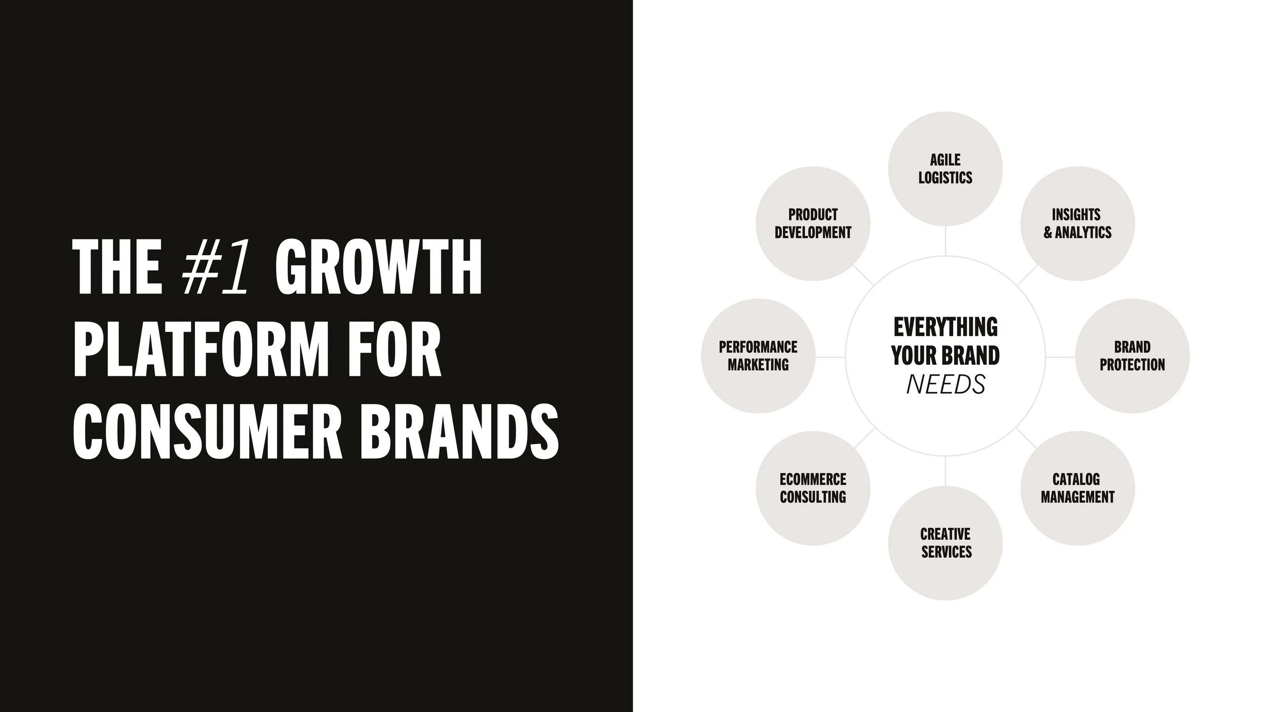
Who is Netrush, now?: Netrush is an ecommerce leader that’s driven by growth, is strategic in it’s actions, and ready to pivot to stay ahead. The ecommerce landscape is ever-changing, unknown at best. But with Netrush’s legacy knowledge in the ecommerce space and operating for almost 15 years, Netrush is able to plan tactically for the future and is ready for what the market brings.


Challenge
The biggest challenge with branding is that this is an ever-evolving brand. Things in ecommerce change quickly and often and Netrush needs branding that can evolve with it. Good branding should be able to stand the test of time for any brand, but things could change within a month’s time, maybe even a week within Netrush. How we talk about ourselves will change often, which effects the messaging and then the brand itself. Lots of considerations were made to seem modern and edgy, yet have a strong foundation to grow and not become outdated. Another consideration is to appear different from our competitors, like Pattern, reCommerce, Kaspien, and others. The goal was to showcase ourselves in a unique way, yet stay true to our business core goals and use visuals that are able to grow with the company throughout any messaging changes.
Outcome
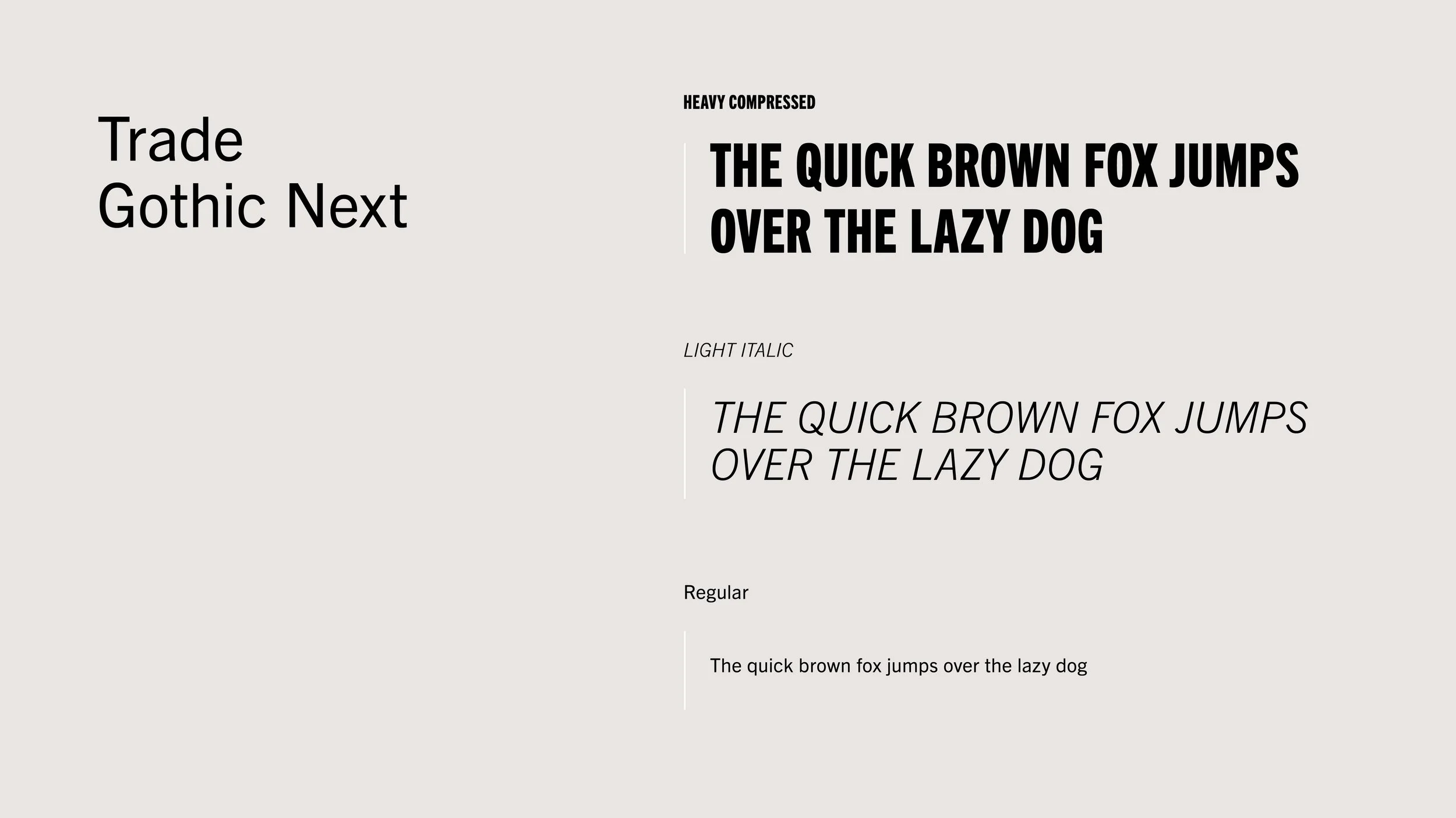
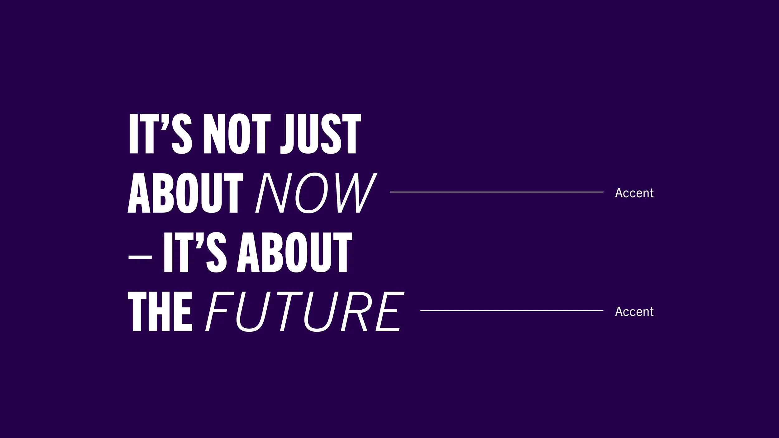
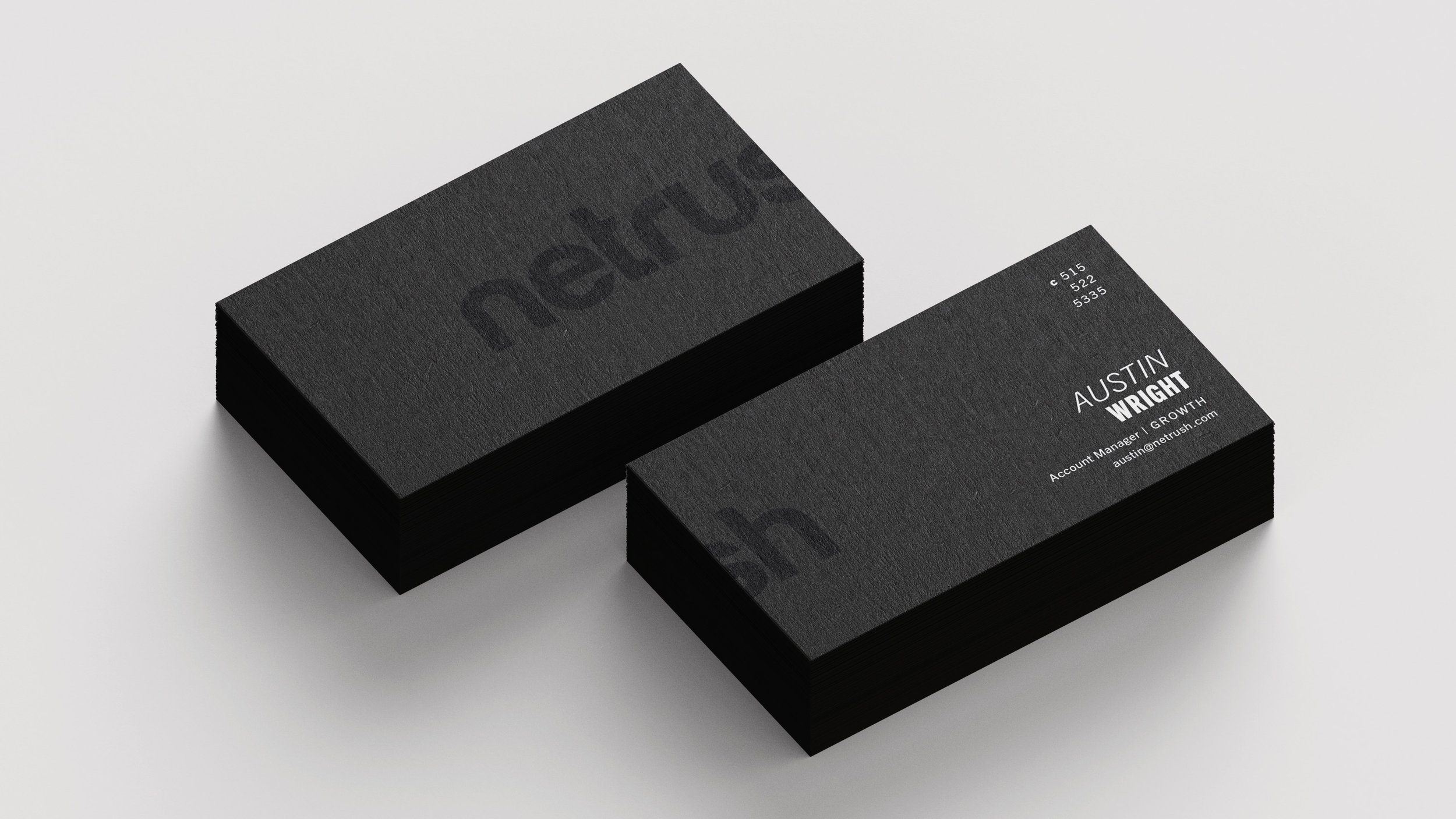
Something that stays true for Netrush throughout time is that Netrush wants to tell brands how they have a lot of experience in this game and that they are the best partner to work with. This results in big, bold, attention-grabbing headlines. I wanted to emphasize parts of our message with accents and give a sense of motion, like we’re moving ahead and looking forward. I paired heavy compressed words with thin, italic words to not only attract the eye, but create a dynamic between these statements that felt visual in of itself. I used Trade Gothic Next since it’s an established font (made back in the 1940s and then updated recently from Linotype) that had a lot of different styles to choose from, which allows for fun, dynamic typography.